
Where is green, when everything seems green? On the handling of colour through nuanced landscapes.
When dealing with landscapes and the natural environment, every photograph asks us to decide what a place looked like, even though there is no single, measurable answer waiting to be recovered. My latest project passes through Australian bush, agricultural pastures, creek systems and rolling farmland. The road and the view changes at every turn, yet I want the finished photographs to feel like one journey. But if every landscape contains a thousand variations of green, what does “consistency” actually mean?
Story time
Last week I made a mistake.
I was foolish enough to tell ChatGPT that I was intending to write an article that I would entitle Where is green?, all about the colour grading of my photo project following the Thunderbolts Way scenic drive through New South Wales. To me, securing my handling of greens was going to be a vital glue, joining the 300-kilometre stretch of varied landscape, agriculture and wilderness together as a coherent body of work. If the photos are to feel like one continuous journey, the colours need to hold it together without feeling artificial.
Like most of my problems, I assumed someone else had already wrestled with this one. Surely there were essays on the process of establishing a consistent and coherent palette across a geographically diverse landscape. I attempted to source existing articles dealing with similar quandaries using a search engine, but found almost nothing. That’s when the AI got involved.
Instead of bringing forward any comparable material to inform or expand my exploration on the subject, ChatGPT confidently informed me that “Australia isn’t actually very green”;
We inherit a European expectation that healthy landscapes are lush emerald green. Eucalypt forests aren’t. They sit somewhere between blue and grey because of the waxy leaves and oils. Dry grasslands are ochre. New growth is lime. River gums have almost white foliage in harsh sun. If you simply increase saturation until something “looks green”, you’ve probably made Australia look less Australian.
A correction
Let’s dispel a myth.
There are some locations in this great country where it may seem that red and brown are the dominant hues. But for every place like that, there is another that has greens as far as the eye can see. We are an agricultural nation (especially animal agriculture, beef in particular), and all around the edges of this country are many many thousands of hectares of pasture-improved land. My subject, Thunderbolts Way, charges straight through vast swathes of this across our “New England” region, literally named by early European settlers for its resemblance to the northern-hemisphere countryside.
That the Australian landscape is somehow devoid of green actually says more about which photographs have become iconic than about the country itself.
The leaves on the trees
The same oversimplification follows the eucalyptus. There are around 900 different species of eucalypt in Australia, and they all appear with slightly different characteristics, preferences, shapes, styles, and colours. But again foreigners tend to believe (probably because they’ve seen one too many colonial oil paintings) that these trees all give off a blue-grey shade. To disprove this too, I stepped outside my studio door and brought back examples of the first two eucalypts I had access to. And guess what?
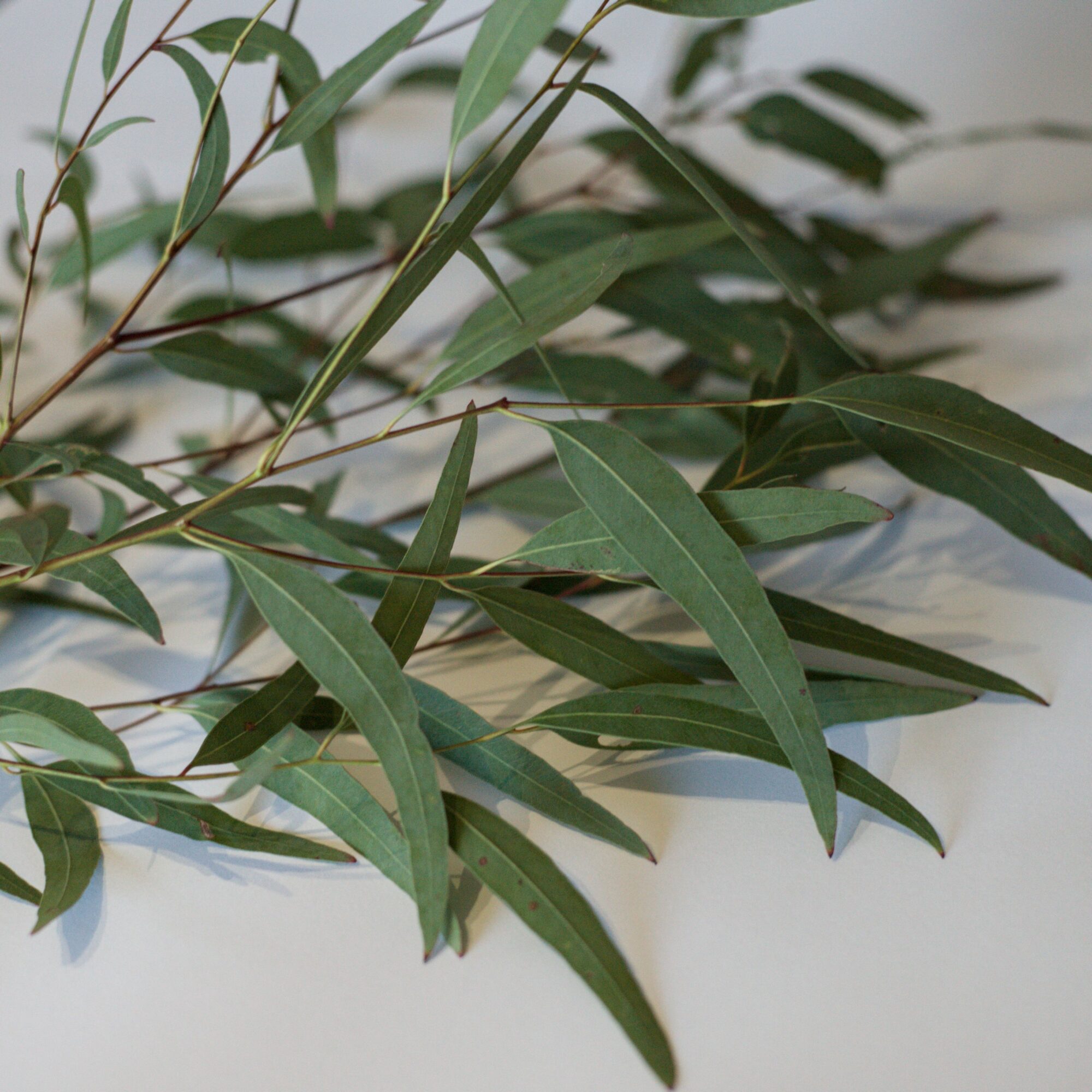
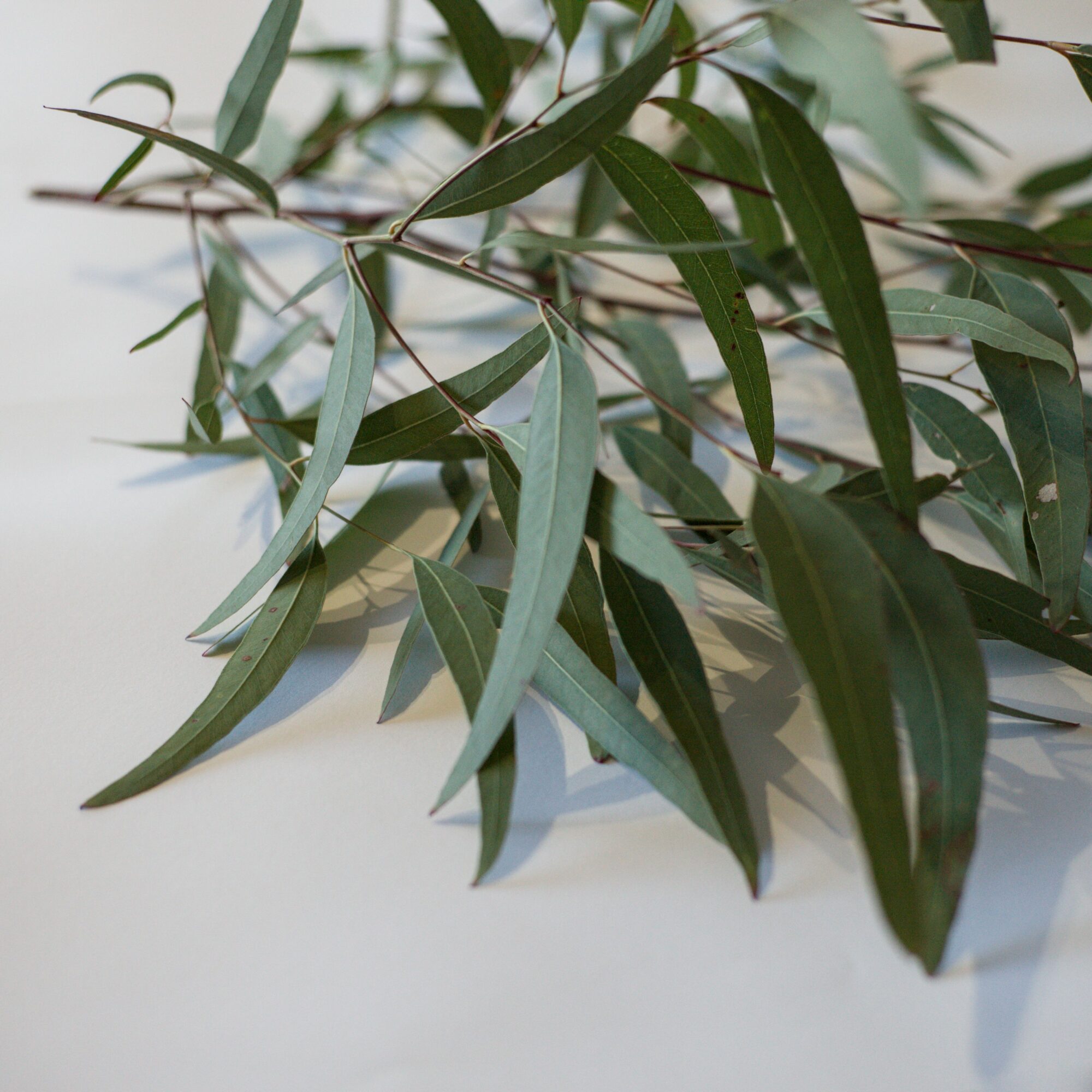
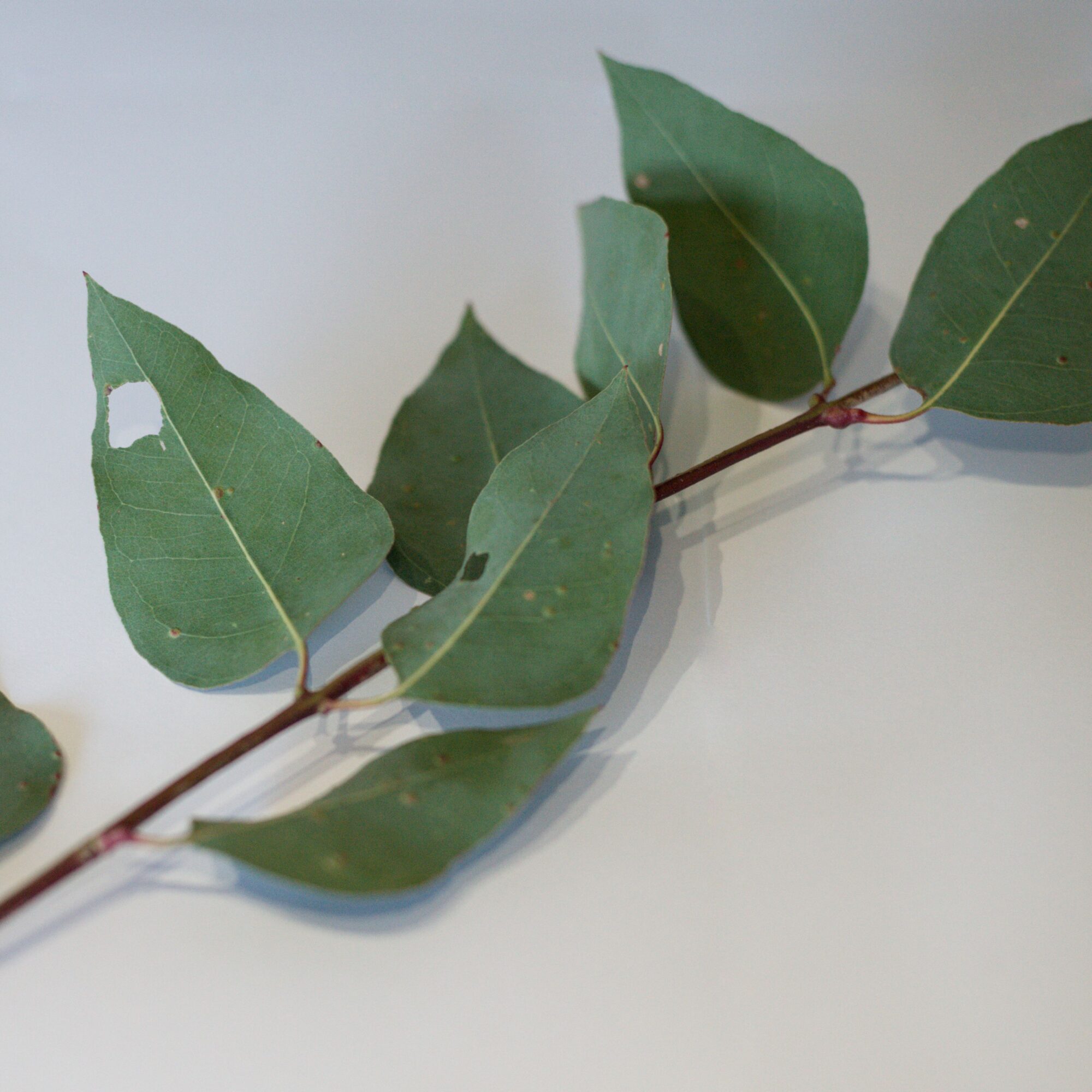
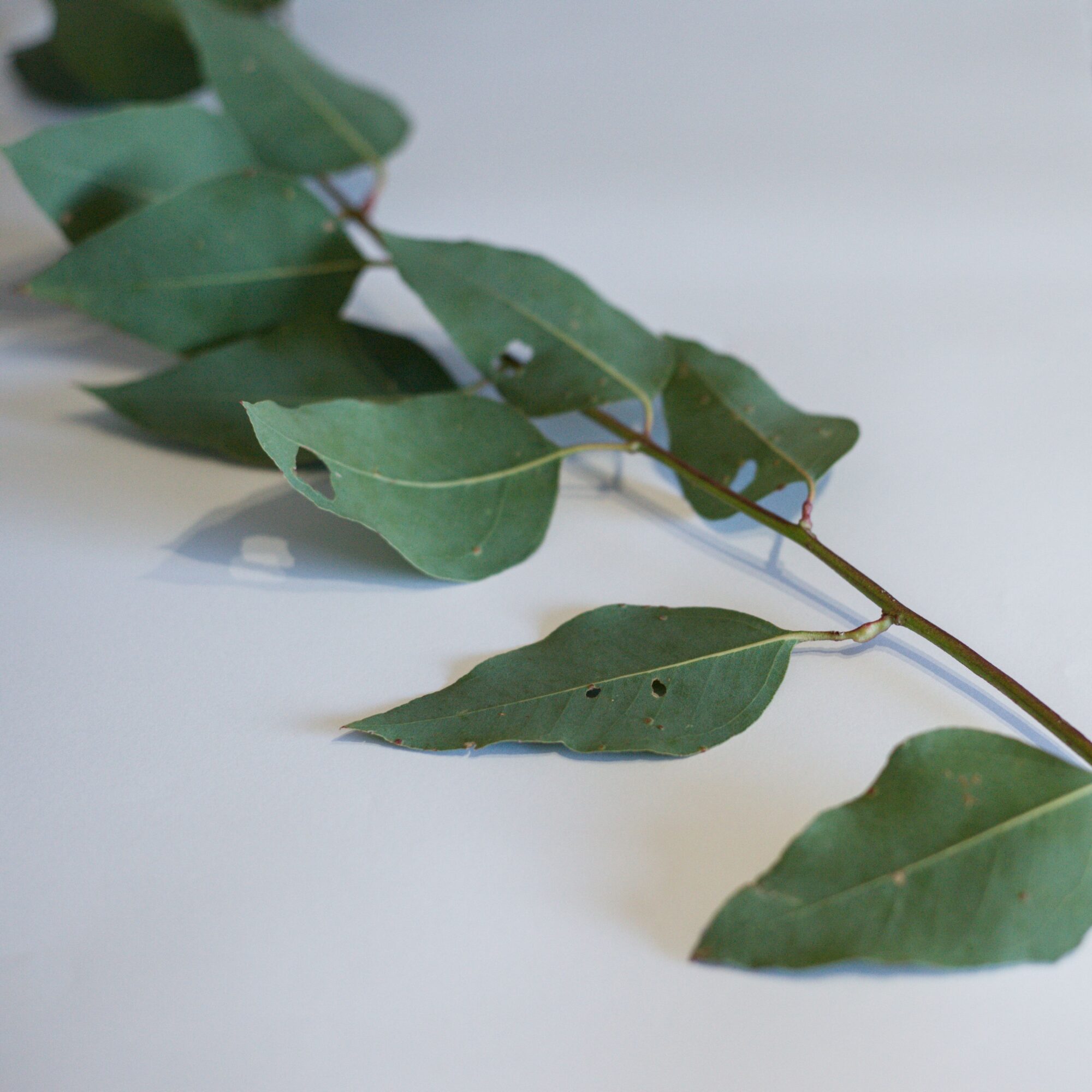
They’re green. Further, if you had to select a secondary colour that both these plants are, it’d be red. You can see the stems are saturated with a warmth that almost resembles chromatic aberration. They’re definitely not blue.
As an aside, I feel it is also worth mentioning that these trees are nowhere near as strong-smelling as you might imagine. They smell, but you have to be right up close in order to garner any real odour from them. Crush the leaves in your hand and the oils give off the distinctive scent, but you can’t really detect this from just wandering along in the Australian bush.
Safety in numbers
Social media and the internet more generally has also been less than helpful in the pursuit of accurate, coherent and pleasing colour grading.
There appears to be a school of contemporary landscape photography that often suppresses greens in favour of muted oranges, browns and warm neutrals, creating a fashionable but geographically implausible look. Artificial golden hours appear through selective masking and exaggerated white balance adjustments. Every valley seems to exist beneath the same amber sunset, regardless of the weather, the time, or the latitude.
I readily admit that photography has always followed aesthetic movements, but such trends are not actually a suitable reference for reality. With the saturation of content and imagery available on the internet, many of us now spend more time looking at photographs than we do observing the landscape itself. After seeing thousands of similarly graded images, they begin to establish their own visual truth. Colours stop representing the world and instead represent what successful landscape photography is expected to look like. An honestly green forest now appears over-edited, while a heavily stylised one feels natural simply because we’ve seen it before.
While I am very happy to forgo the trends reinforced by content algorithms, popular presets or influential creators, the realisation that “natural” colour isn’t entirely objective but is now also cultural, might be the ultimate challenge. How does one balance variation with cohesion, and expectation with reality?
My choice
Ultimately, the purpose of this project is neither to produce the most fashionable interpretation of Thunderbolts Way, nor the most technically neutral one. It is to produce a body of work that feels faithful to the experience of travelling the road. Some areas are really green. Let’s resist the temptation to force every photograph towards an identical palette simply because it performs well on social media. Consistency matters, but not at the expense of place, reality and documentary.
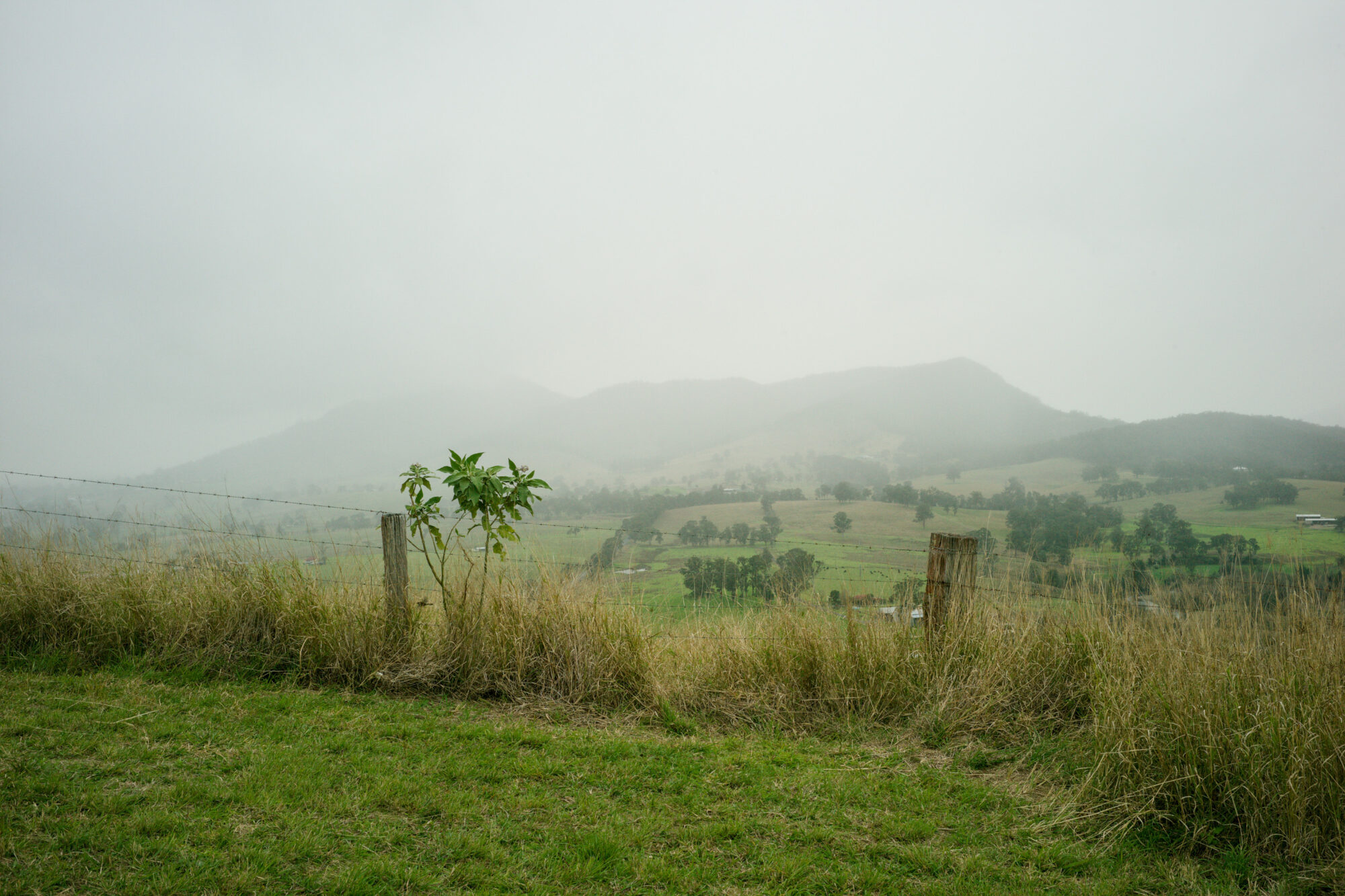
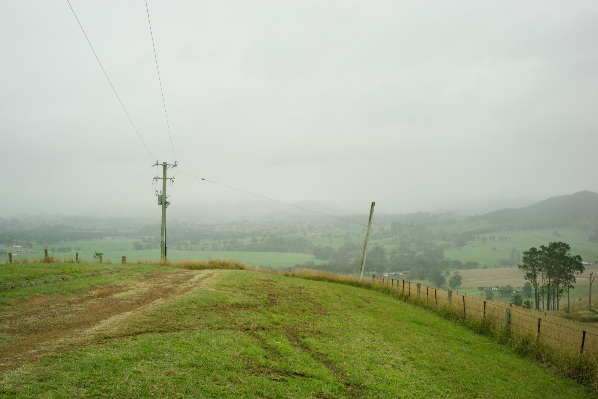
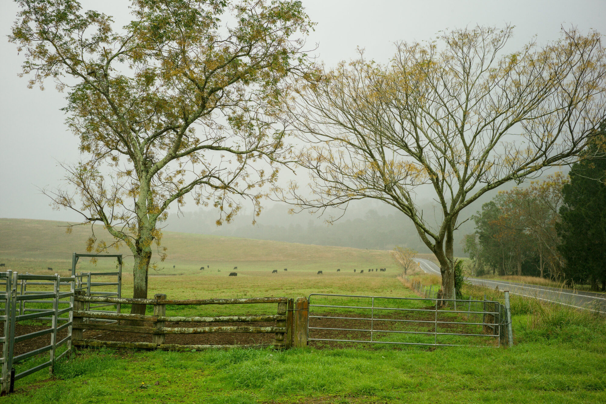
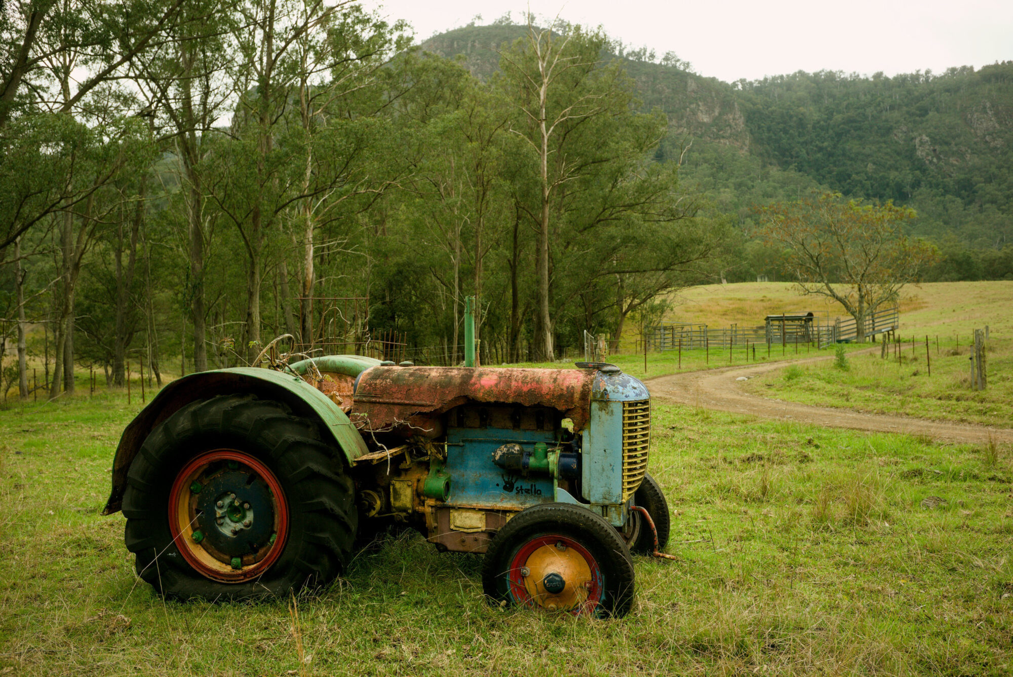
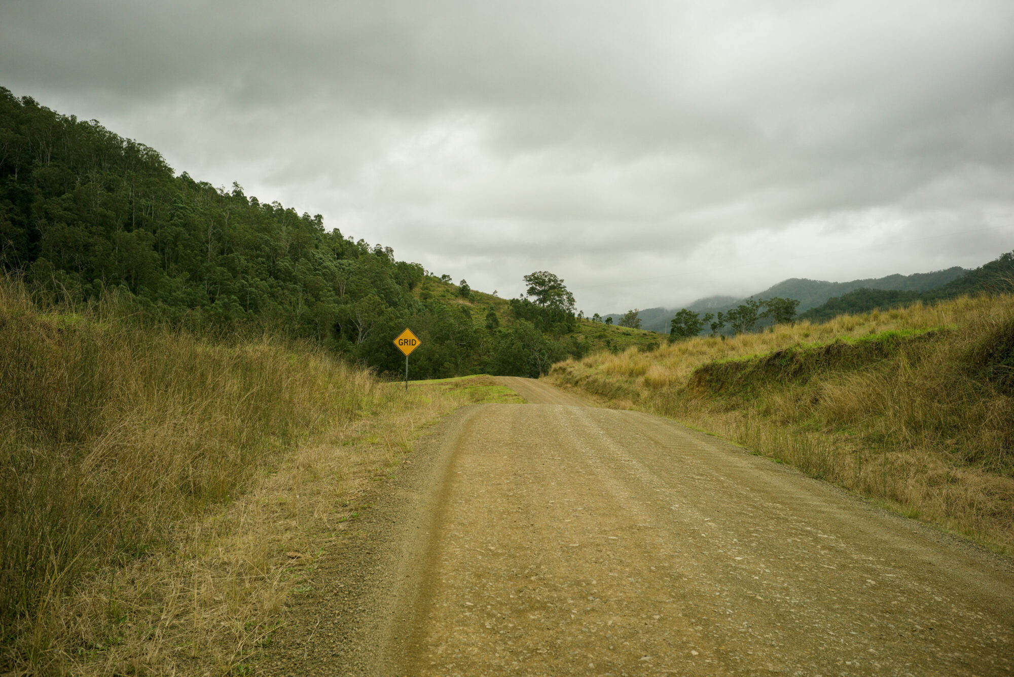
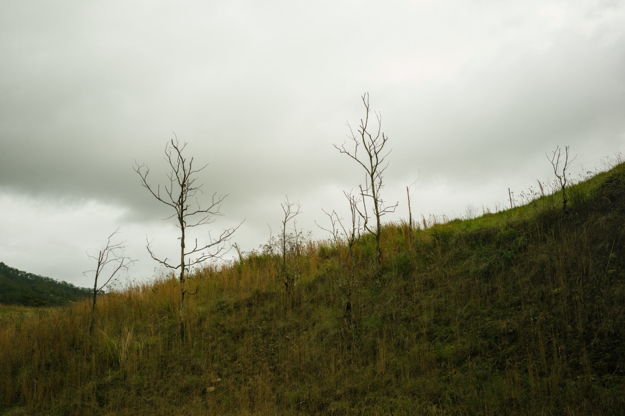
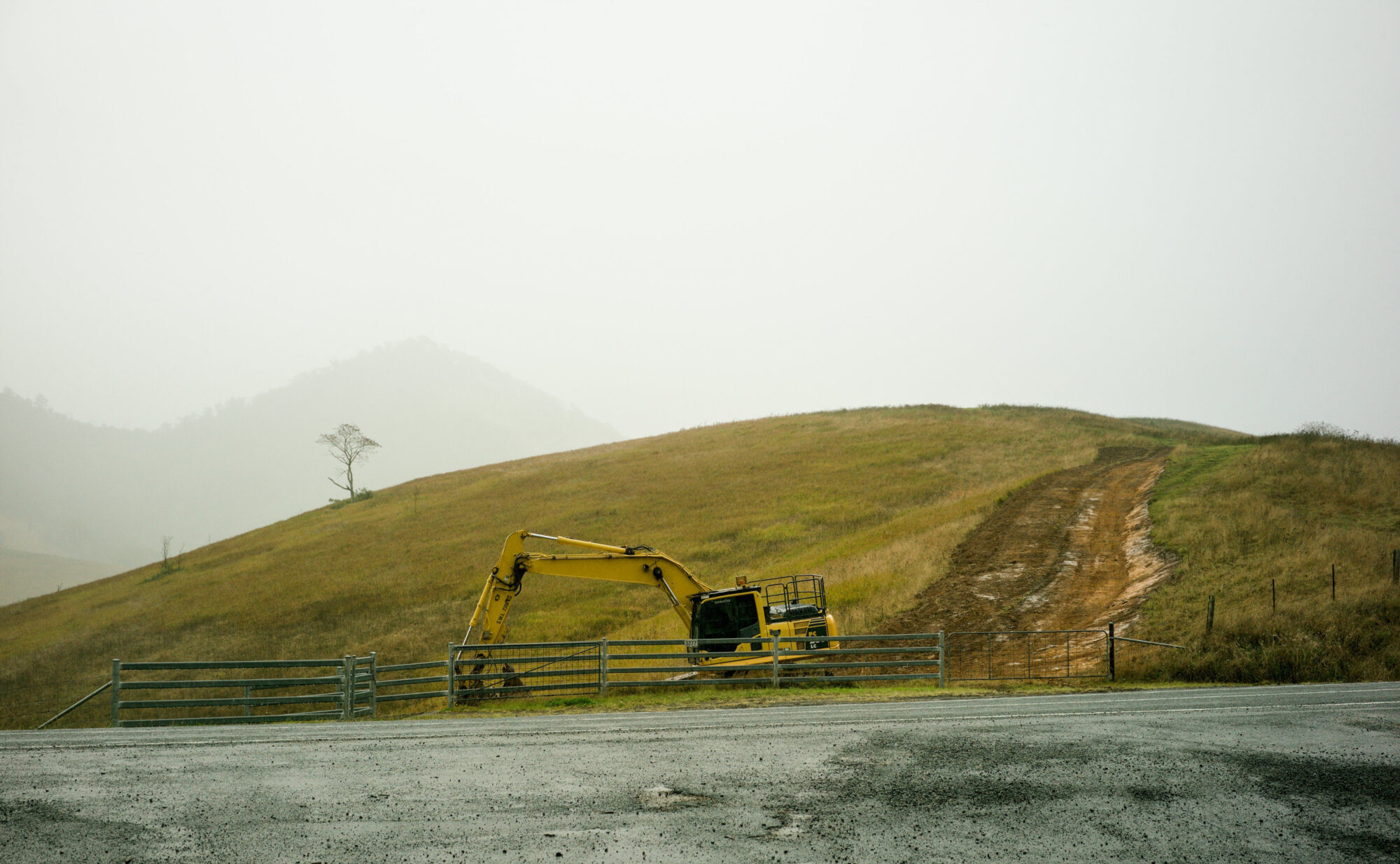
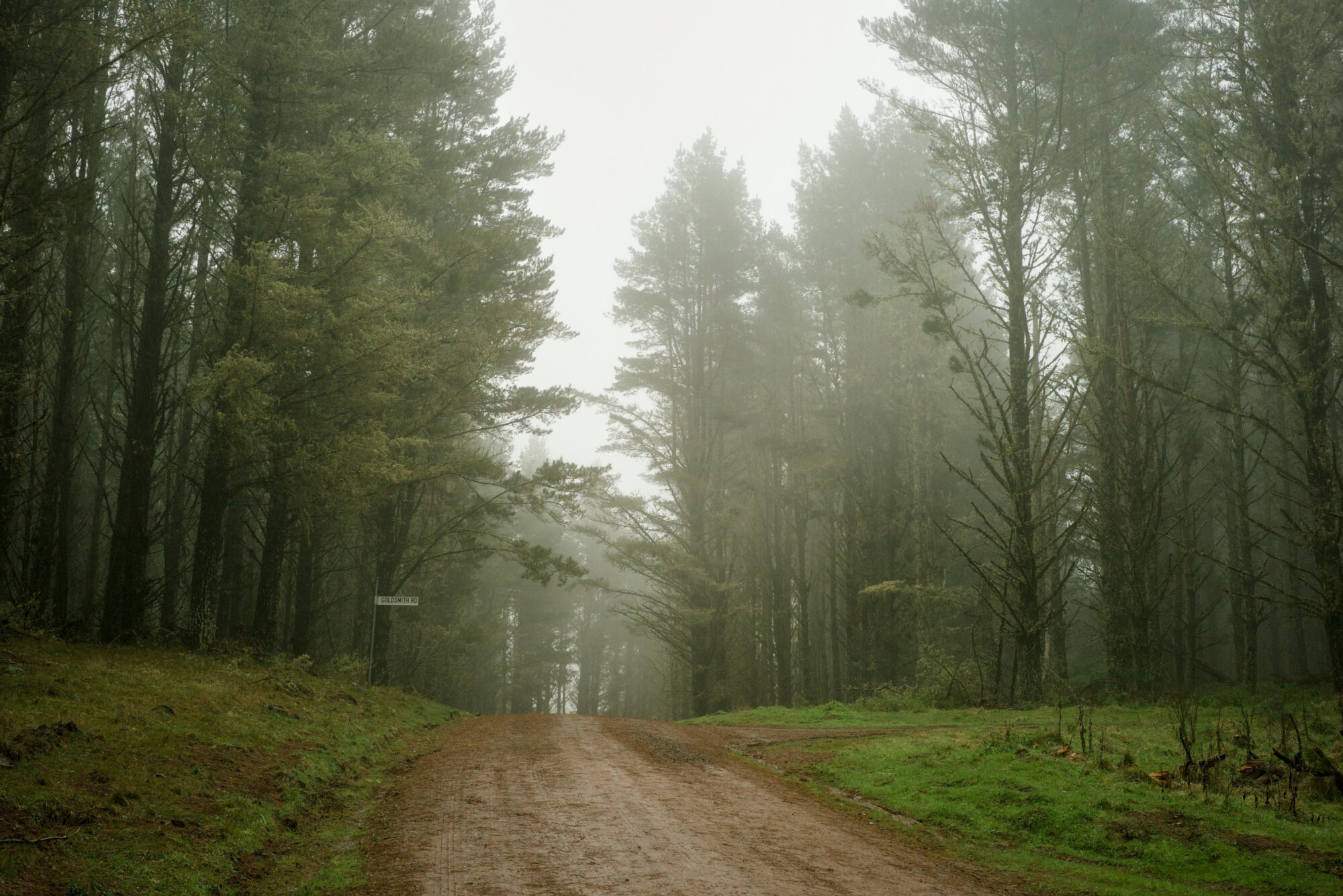
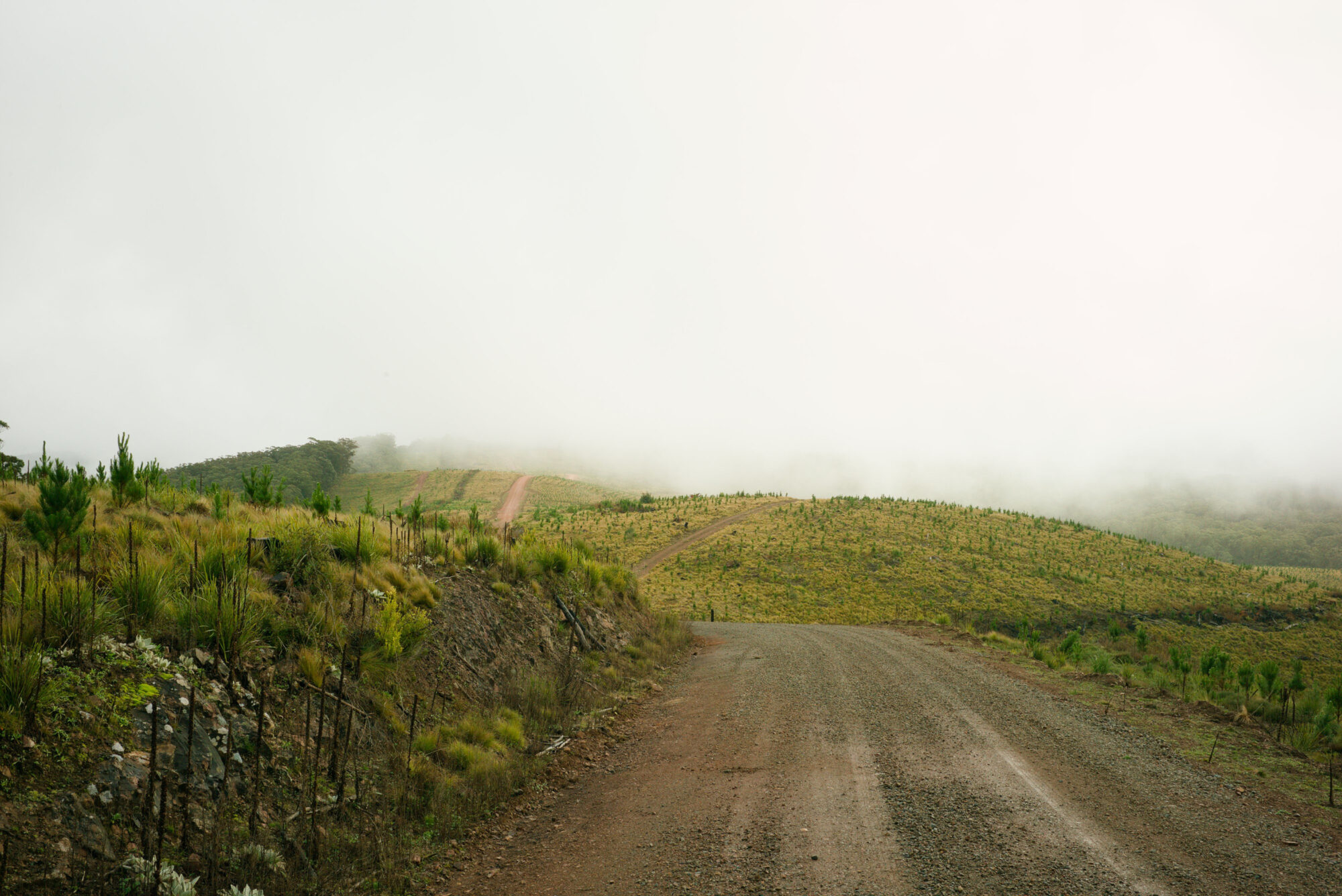
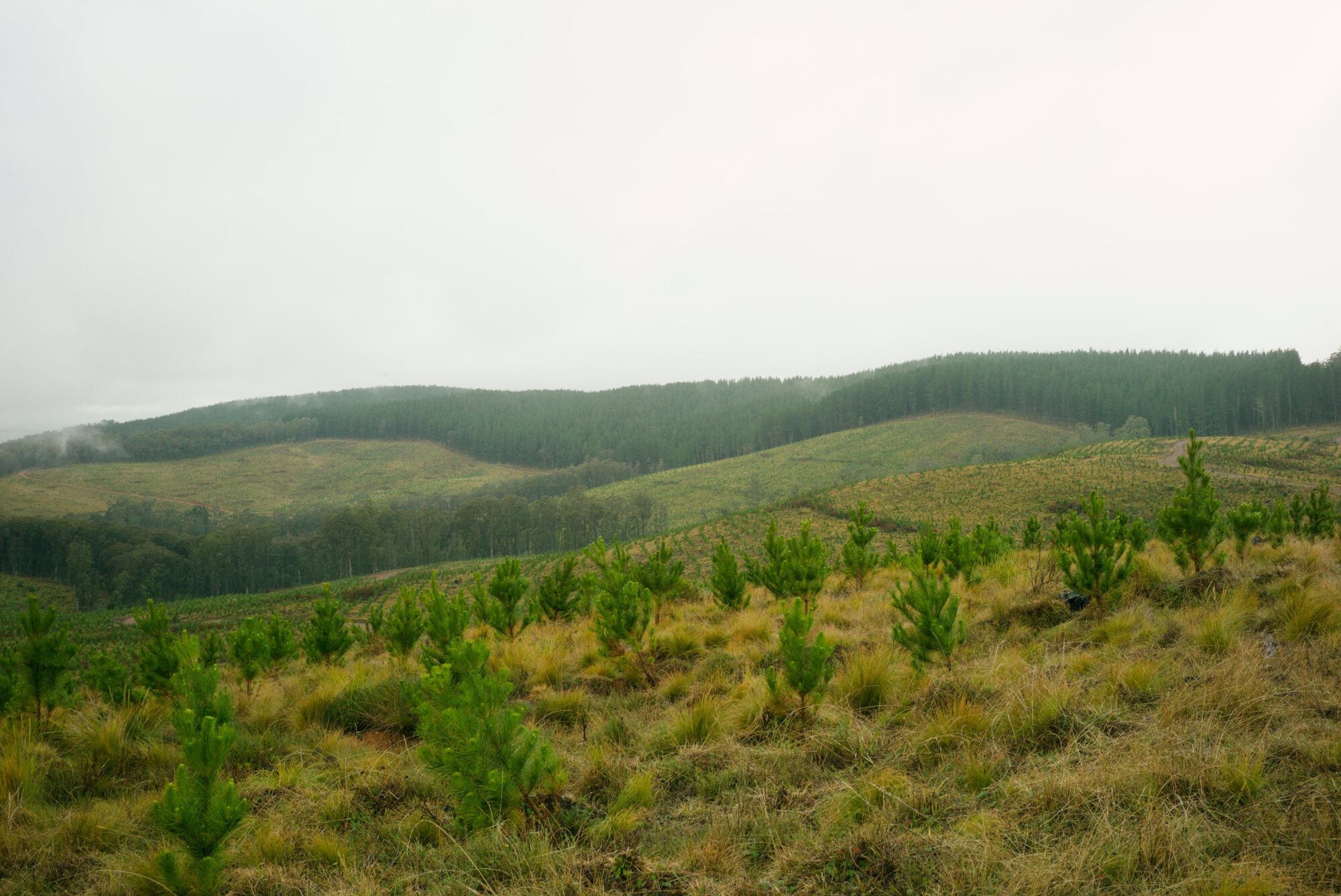
Below is an early selection from the project. These photographs aren’t intended as final colour references, but they’re part of the process in establishing the direction I’m aiming for. Greens remain Australian, without being desaturated into grey-brown or blown out into fluorescent emerald. They vary with time, location and conditions, but still belong to the same visual set.
Leave a Reply